The Ultimate Guide to Kitchen Colors According to Vastu Shastra
Ever wondered why some kitchens just feel right while others don’t? The answer might lie in Vastu Shastra, an ancient Indian science of architecture and design. Vastu Shastra emphasizes the importance of aligning our living spaces with natural forces to enhance health, happiness, and prosperity. This guide delves into the best colors for your kitchen according to Vastu principles.
The Role of Colors in Vastu Shastra
Significance of Colors in Vastu
Colors play a crucial role in Vastu Shastra. They influence the energy flow in your home, affecting your mood and well-being. The right colors can create a balanced and positive environment, while the wrong ones can lead to stress and negativity.
How Colors Affect Energy and Mood
Each color carries a specific energy and can evoke particular emotions. For instance, red is energizing, blue is calming, and green promotes harmony. Understanding these effects can help you choose the best colors for each room in your home, particularly the kitchen.
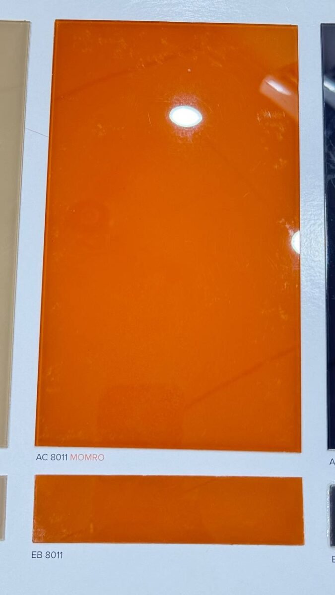
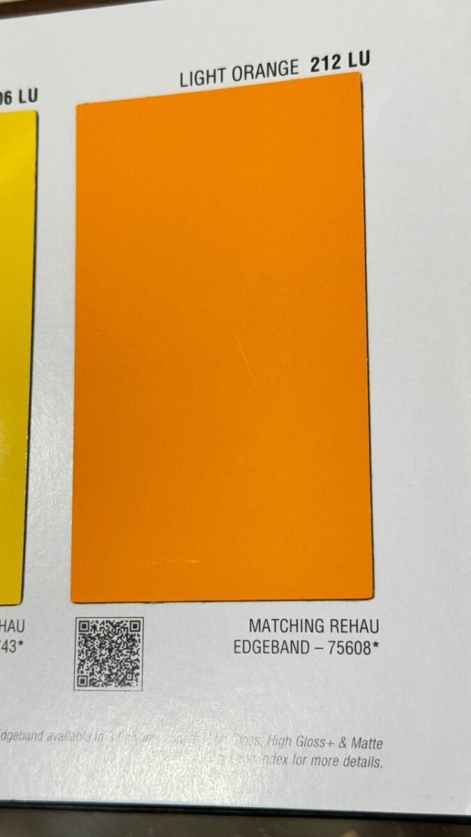
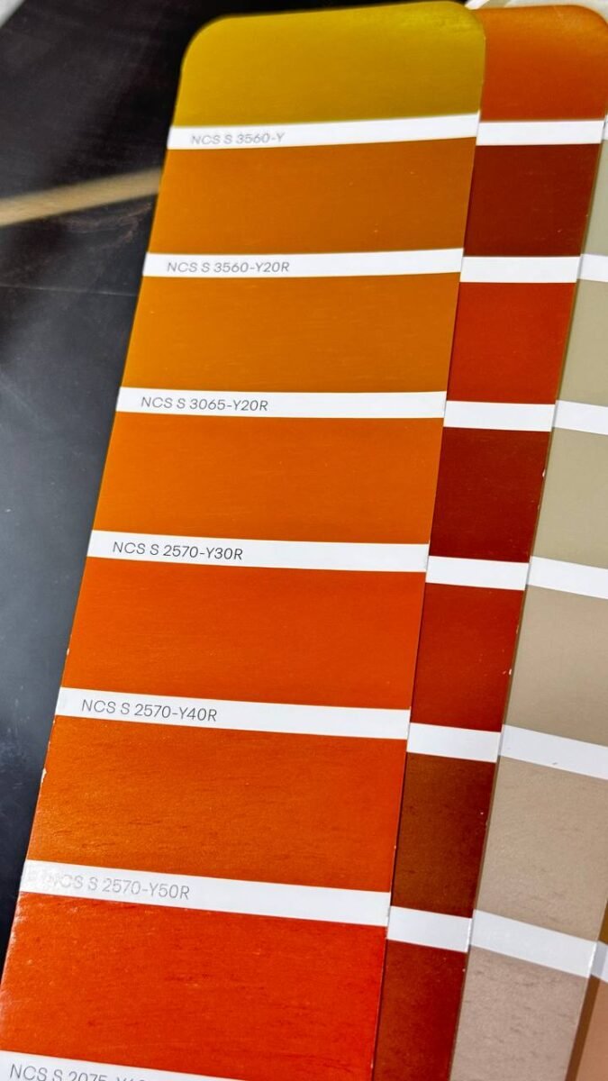
Orange: The Optimizer
Benefits of Orange in the Kitchen
Orange is a vibrant and energetic color that stimulates appetite and conversation, making it perfect for kitchens. It represents enthusiasm, creativity, and joy.
How to Incorporate Orange Without Overwhelming the Space
You don’t need to paint your entire kitchen orange. Instead, use orange as an accent color. Think of orange backsplashes, utensils, or even small appliances to add a pop of energy.
Examples of Orange Accents
Consider orange bar stools, pendant lights, or a fruit bowl. These small touches can transform your kitchen without making it look too busy.
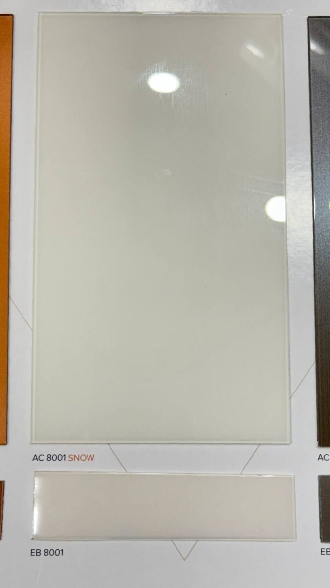
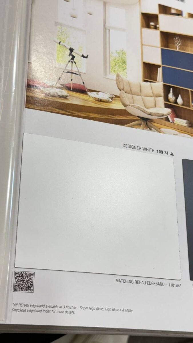
White: The Symbol of Purity
Why White is a Big Yes for Kitchens
White symbolizes purity and cleanliness, essential qualities for a kitchen. It reflects light, making the space look larger and more open.
The Psychological Impact of White
White creates a sense of calm and order. It’s perfect for those who want a serene and uncluttered kitchen environment.
Tips for Designing an All-White Kitchen
To avoid a sterile look, mix textures and materials. Combine glossy white cabinets with matte countertops, or add a wooden floor for warmth.
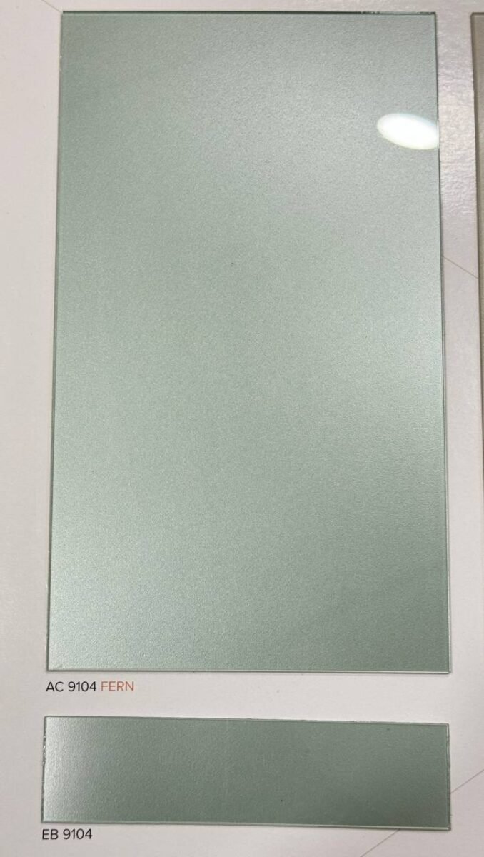
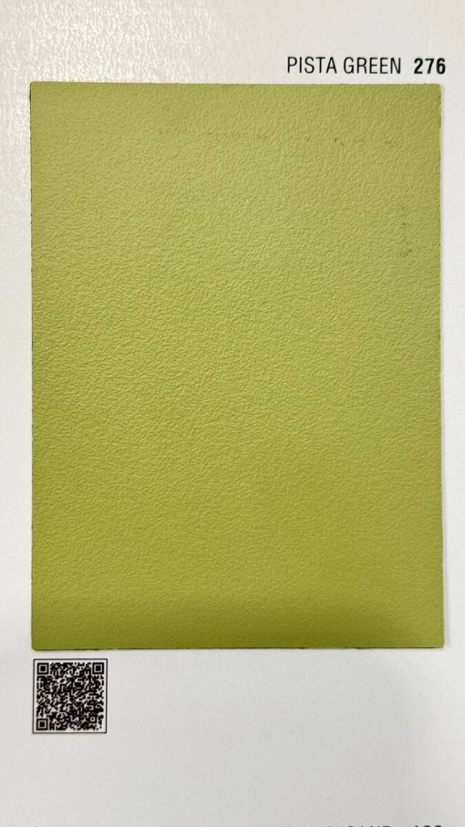
Green: The Harbinger of Hope and Harmony
The Positive Vibes of Green
Green is associated with nature, growth, and renewal. It brings a sense of balance and harmony to your kitchen.
Different Shades of Green for Your Kitchen
From vibrant emerald to soft pastel green, there are many shades to choose from. Lighter shades can make your kitchen feel airy, while darker greens can add a touch of elegance.
Combining Green with Other Colors
Green pairs well with white, beige, and wood tones. You can use green for cabinets or as an accent wall, balanced with neutral colors.
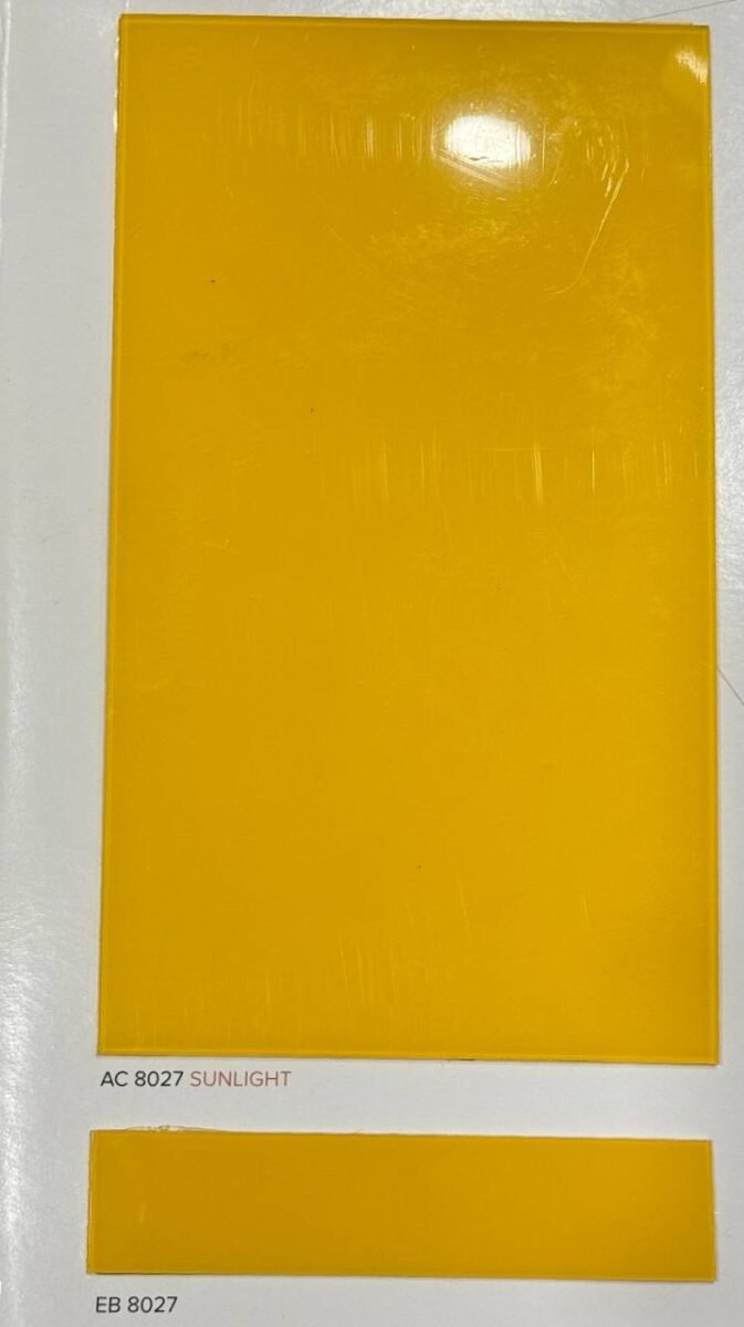
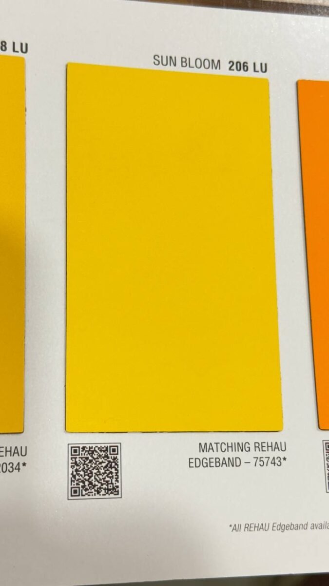
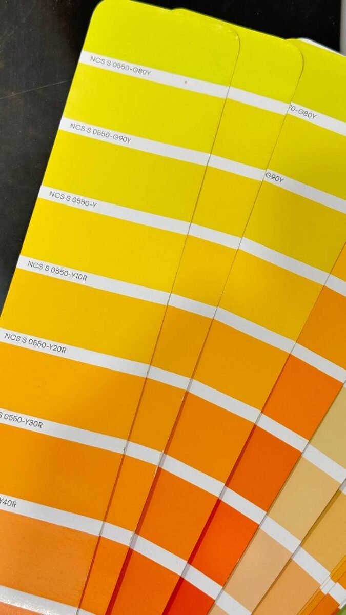
Yellow: The Color of Fire and Energy
The Symbolism of Yellow in Vastu
Yellow represents fire and energy, making it a lively choice for kitchens. It’s associated with happiness, positivity, and creativity.
Best Ways to Use Yellow in the Kitchen
Use yellow sparingly to avoid overwhelming the space. Consider yellow cabinets, a backsplash, or decorative elements.
Balancing Yellow with Other Elements
Combine yellow with neutral colors like white or grey to create a balanced look. Yellow accessories can also add warmth to an otherwise neutral kitchen.
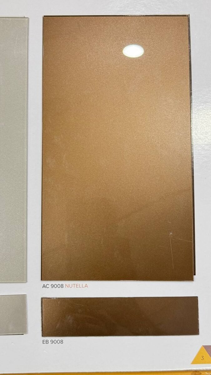
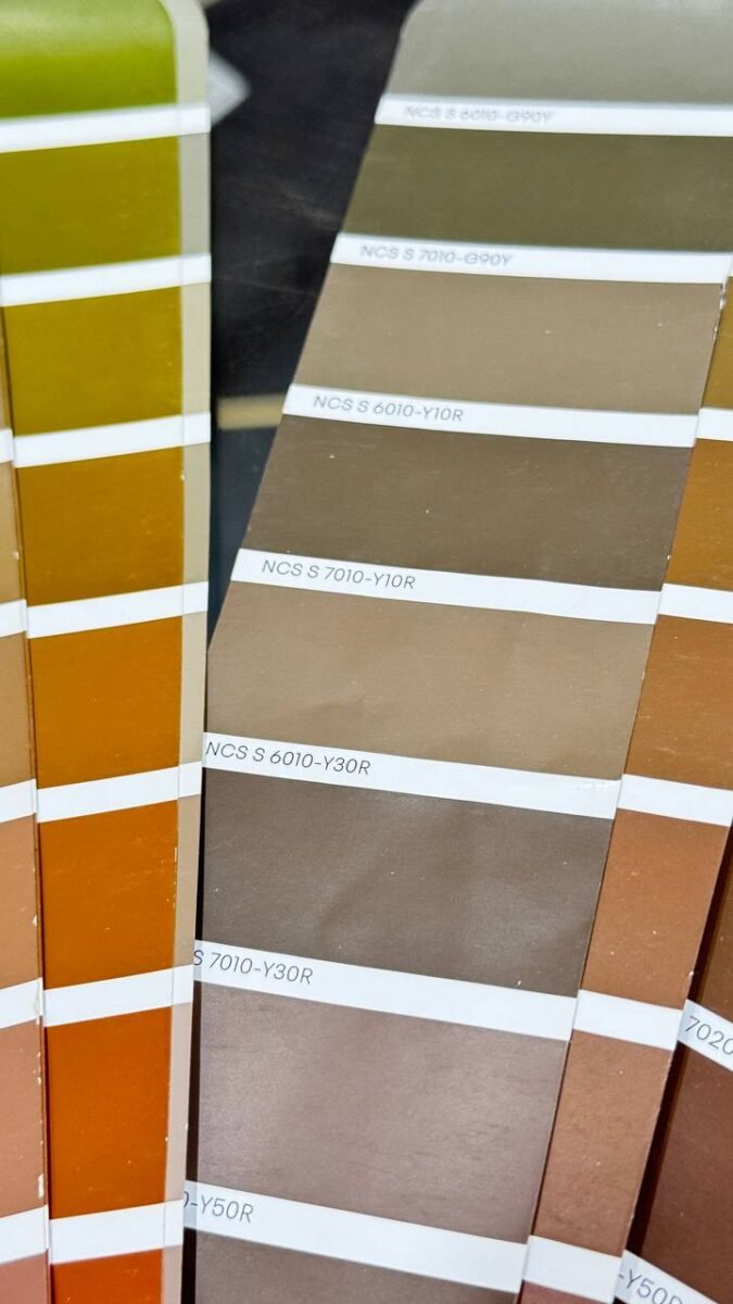
Brown: The Warm Embrace of Wood
The Comforting Nature of Brown
Brown, especially in wood tones, brings warmth and comfort. It’s perfect for creating a cozy and inviting kitchen.
Choosing the Right Shades of Brown
Opt for natural wood finishes or shades like chocolate, caramel, and taupe. These tones add depth and richness to your kitchen.
Brown Accents for a Cozy Kitchen
Consider wooden cabinets, countertops, or even flooring. Brown pairs well with almost any color, making it a versatile choice.
Combining Colors for a Vastu-Friendly Kitchen
Tips for Blending Colors Harmoniously
When combining colors, ensure they complement each other. Stick to a cohesive color scheme to avoid a cluttered look.
Avoiding Clutter and Overwhelm
Use colors strategically to highlight specific areas. For example, a colorful backsplash can be the focal point, while the rest of the kitchen remains neutral.
Practical Design Ideas
Mix and match different textures and materials. For example, combine glossy and matte finishes, or pair metal with wood.
Vastu-Friendly Kitchen Layouts
Ideal Kitchen Placement
According to Vastu, the kitchen should be in the southeast corner of the house. This placement aligns with the element of fire, promoting health and prosperity.
Best Directions for Cooking and Dining
When cooking, face east or north. For dining, sit facing east, north, or west for positive energy flow.
Conclusion
Choosing the right colors for your kitchen according to Vastu Shastra can transform the space into a harmonious and inviting environment. By incorporating colors like orange, white, green, yellow, and brown, you can create a kitchen that not only looks great but also feels great to be in. Remember, it’s all about balance and making sure your kitchen reflects the positive energy you want in your home.